Custom CSS
Skin your knowledge base
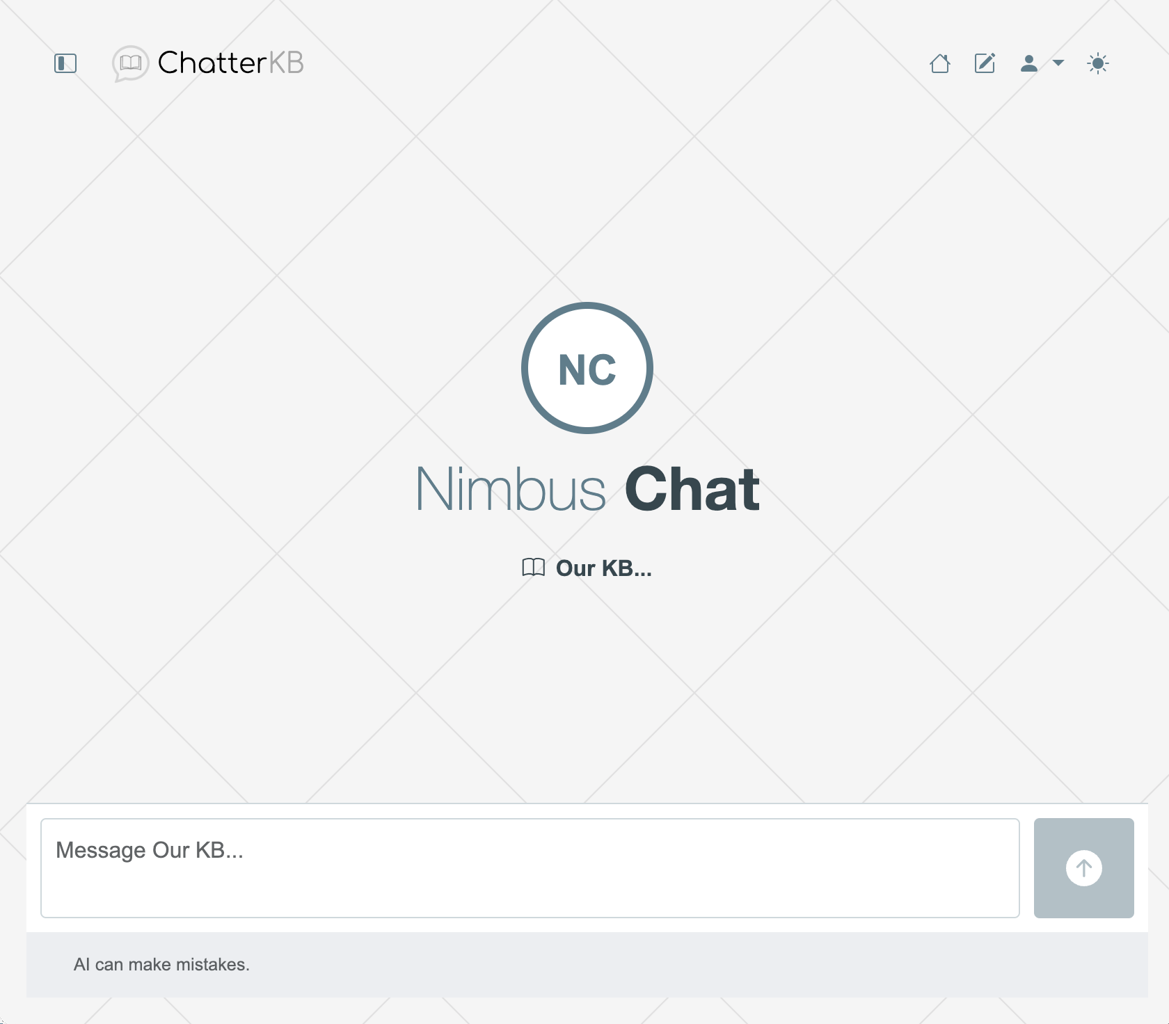
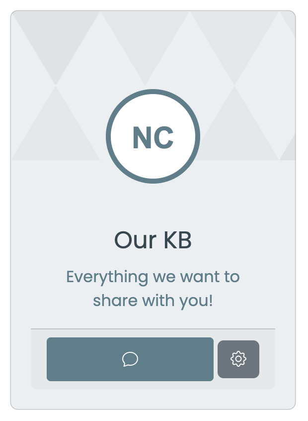
You can skin your knowledge base by providing your own CSS. This is a great way to make your knowledge base reflect your brand. Note:

How to Use
Create the CSS file for your theme and copy the code into the knowledge base settings. You can access the settings by clicking on the gear icon for the knowledge base and then clicking “Style”. Here are some example CSS files you can use as a starting point. These are a few examples of what you can do. For a full list of classes, see the knowledge base style controls.
Download Example 2 CSS (Simple)
Core Layout Components
Body & Container
.chatterkb-body {
  background-color: #F5F5F5;
  background-image: url("data:image/svg+xml,%3Csvg xmlns='http://www.w3.org/2000/svg' width='200' height='200' viewBox='0 0 200 200'%3E%3Crect width='200' height='200' fill='%23F5F5F5'/%3E%3Cpath d='M0 0 L200 200 M200 0 L0 200' stroke='%23E0E0E0' stroke-width='1'/%3E%3C/svg%3E");
  font-family: 'Poppins', Arial, sans-serif;
}

.chatterkb-chat-sidebar {
  background-color: #ffffff;
  color: #37474F;
}
Navigation & Header
.chatterkb-nav-link {
  color: #607D8B !important;
}

.chatterkb-brand-text {
  color: #607D8B;
  font-family: 'Poppins', Arial, sans-serif;
}
Knowledge Base Components
Knowledge Base Card
.chatterkb-card {
  background-color: #ECEFF1;
  background-image: url("data:image/svg+xml,%3Csvg xmlns='http://www.w3.org/2000/svg' width='540' height='450' viewBox='0 0 1080 900'%3E%3Cg fill-opacity='0.05'%3E%3Cpolygon fill='%23455A64' points='90 150 0 300 180 300'/%3E%3Cpolygon points='90 150 180 0 0 0'/%3E%3Cpolygon fill='%23455A64' points='270 150 360 0 180 0'/%3E%3Cpolygon fill='%23455A64' points='450 150 360 300 540 300'/%3E%3Cpolygon fill='%23455A64' points='450 150 540 0 360 0'/%3E%3Cpolygon points='630 150 540 300 720 300'/%3E%3Cpolygon fill='%23455A64' points='630 150 720 0 540 0'/%3E%3Cpolygon fill='%23455A64' points='810 150 720 300 900 300'/%3E%3Cpolygon fill='%23455A64' points='810 150 900 0 720 0'/%3E%3Cpolygon fill='%23455A64' points='990 150 900 300 1080 300'/%3E%3Cpolygon fill='%23455A64' points='990 150 1080 0 900 0'/%3E%3C/g%3E%3C/svg%3E");
  color: #37474F;
  font-family: 'Poppins', Arial, sans-serif;
}

.chatterkb-card-kb-name {
  color: #37474F;
  font-family: 'Poppins', Arial, sans-serif;
}

.chatterkb-card-kb-description {
  color: #607D8B;
  font-family: 'Poppins', Arial, sans-serif;
}
Action Buttons
.chatterkb-join-subscribe-btn {
  background-color: #4FC3F7;
  border: 1px solid #4FC3F7;
  color: #ffffff;
  font-family: 'Poppins', Arial, sans-serif;
}

.chatterkb-join-subscribe-btn:hover {
  background-color: #039BE5;
  color: #ffffff;
}

.chatterkb-join-sign-up-btn {
  background-color: #4FC3F7;
  border: 1px solid #4FC3F7;
  color: #ffffff;
  font-family: 'Poppins', Arial, sans-serif;
}

.chatterkb-join-sign-up-btn:hover {
  background-color: #039BE5;
  color: #ffffff;
}

.chatterkb-new-chat-btn {
  background-color: #607D8B;
  color: #ffffff;
  font-family: 'Poppins', Arial, sans-serif;
}

.chatterkb-new-chat-btn:hover {
  background-color: #455A64;
}
Conversation Components
Conversation List
.chatterkb-conversations-list-group {
  background-color: #FAFAFA !important;
}

.chatterkb-conversations-list-item {
  background-color: #f8f9fa;
  color: #6c757d;
  font-family: 'Poppins', Arial, sans-serif;
}

.chatterkb-conversations-list-item:hover {
  background-color: #ECEFF1;
}

.chatterkb-conversations-list-item.active {
  background-color: #B0BEC5 !important;
  color: #37474F;
}

.chatterkb-conversation-name {
  color: #37474F !important;
  font-family: 'Poppins', Arial, sans-serif;
}
Chat Elements
.chatterkb-chat-prompt {
  background-color: #FFFFFF;
  border-radius: 20px;
}

.chatterkb-chat-prompt-input {
  background-color: #ffffff;
  color: #212529;
  font-family: 'Poppins', Arial, sans-serif;
}

.chatterkb-chat-response {
  color: #37474F !important;
  background-color: #FFFFFF;
  border-radius: 20px;
  font-family: 'Poppins', Arial, sans-serif;
}

.chatterkb-chat-kb-name {
  color: #607D8B;
  font-family: 'Poppins', Arial, sans-serif;
}
Theme Variations
Light Theme
.chatterkb-chat-prompt-input-container {
  background-color: #f8f9fa;
}

.chatterkb-chat-footer {
  background-color: #f8f9fa;
  color: #6c757d;
  font-family: 'Poppins', Arial, sans-serif;
}

.chatterkb-chat-send-btn {
  background-color: #607D8B;
  color: #ffffff;
  border-radius: 4px;
}

.chatterkb-chat-send-btn:hover {
  background-color: #455A64;
}
Dark Theme
.chatterkb-body[data-bs-theme="dark"] {
  background-color: #263238;
  background-image: url("data:image/svg+xml,%3Csvg xmlns='http://www.w3.org/2000/svg' width='200' height='200' viewBox='0 0 200 200'%3E%3Crect width='200' height='200' fill='%23263238'/%3E%3Cpath d='M0 0 L200 200 M200 0 L0 200' stroke='%2337474F' stroke-width='1'/%3E%3C/svg%3E");
}

.chatterkb-body[data-bs-theme="dark"] .chatterkb-chat-prompt-input-container {
  background-color: #343a40;
}

.chatterkb-body[data-bs-theme="dark"] .chatterkb-chat-footer {
  background-color: #343a40;
  color: #adb5bd;
}

.chatterkb-body[data-bs-theme="dark"] .chatterkb-chat-send-btn {
  background-color: #607D8B;
  color: #ffffff;
}

.chatterkb-body[data-bs-theme="dark"] .chatterkb-chat-send-btn:hover {
  background-color: #455A64;
}

.chatterkb-body[data-bs-theme="dark"] .chatterkb-chat-prompt {
  background-color: #424242;
  color: #ECEFF1;
}

.chatterkb-body[data-bs-theme="dark"] .chatterkb-chat-response {
  background-color: #455A64;
  color: #ECEFF1 !important;
}

.chatterkb-body[data-bs-theme="dark"] .chatterkb-chat-sidebar {
  background-color: #212529;
  color: #f8f9fa;
}
Any questions? Contact us